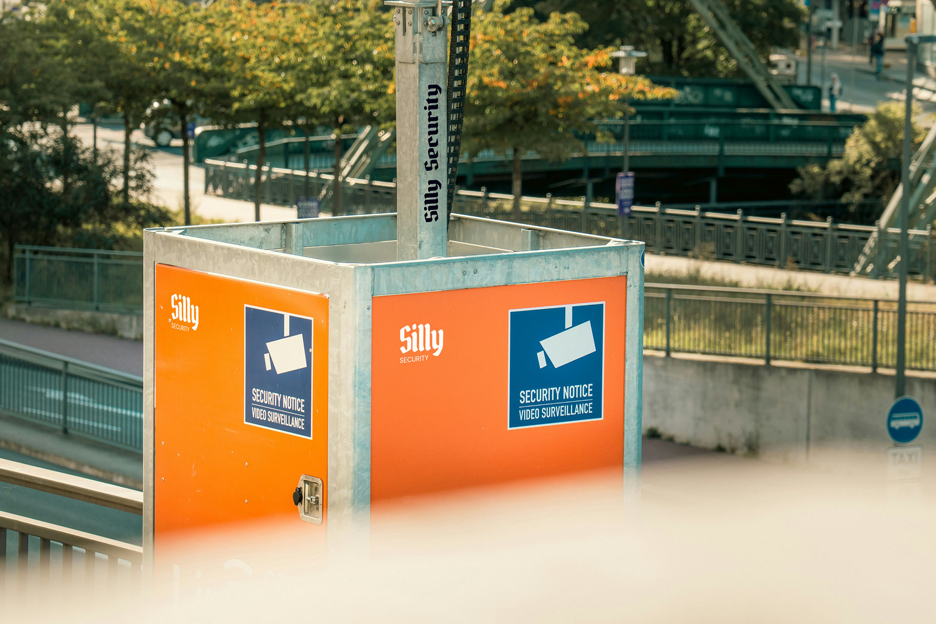
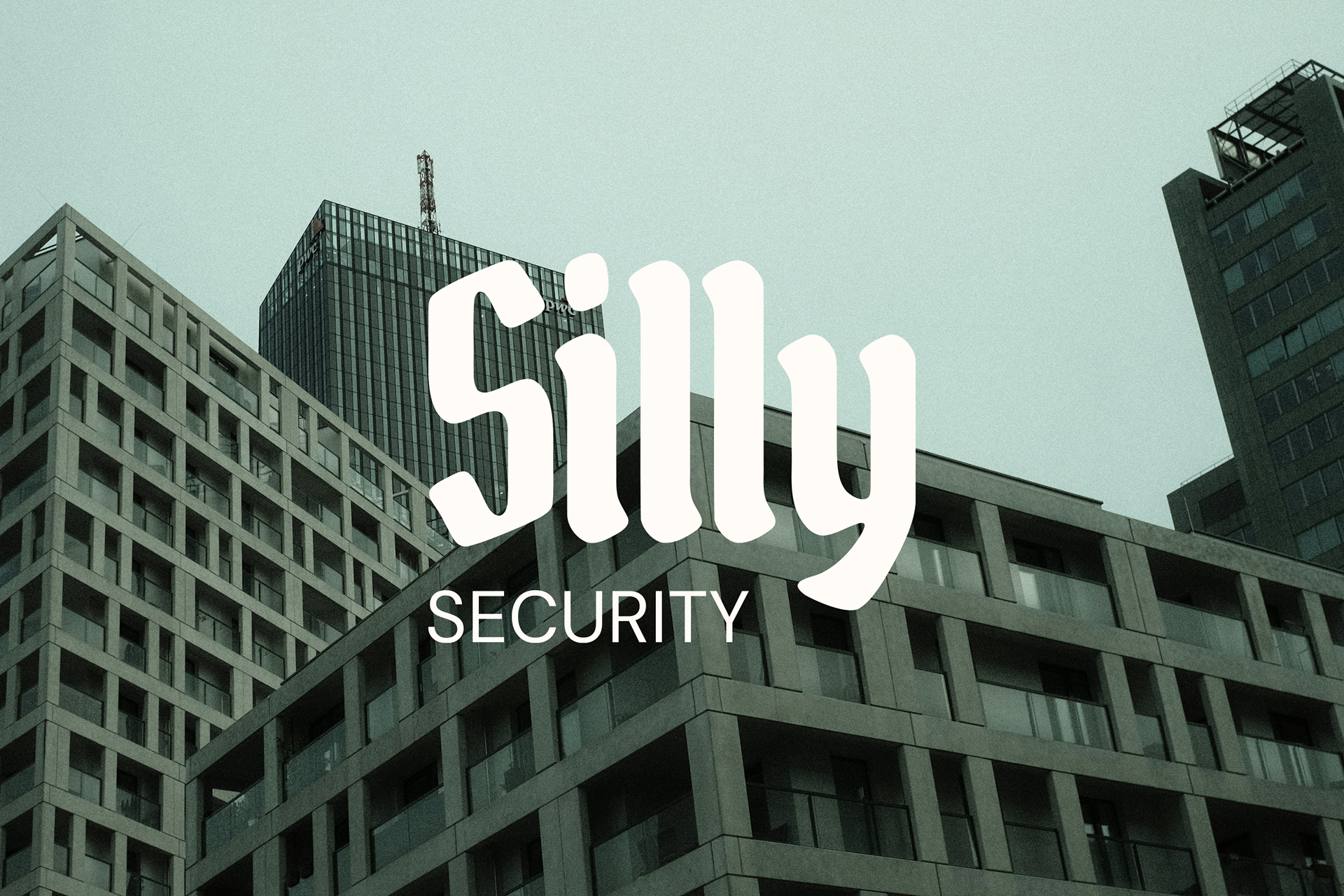
Silly Security is a fictional security company built on contrast. The name disarms, while the identity communicates authority, heritage, and trust. The goal was to explore how tension between verbal tone and visual language can create a memorable and strategically strong brand.
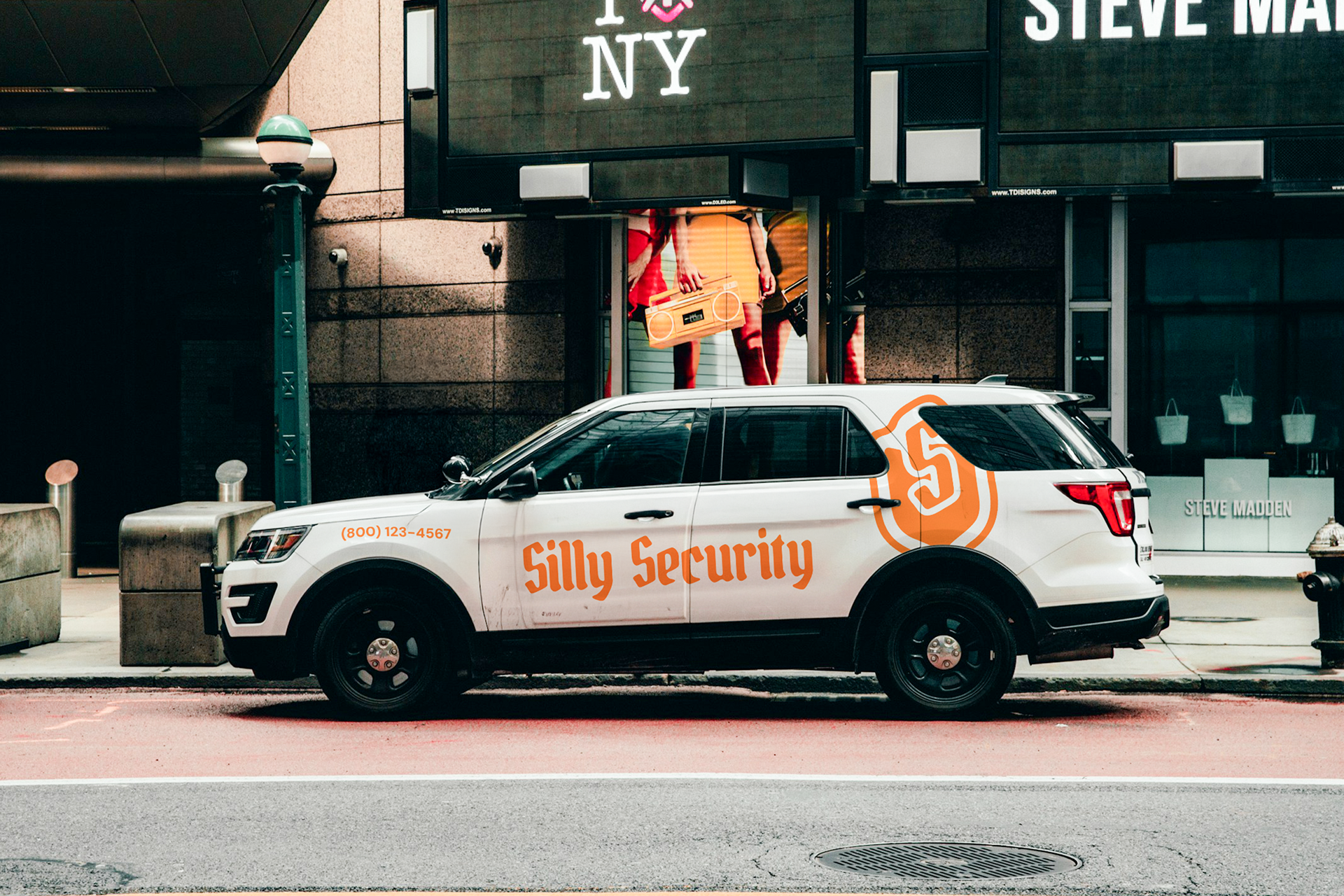
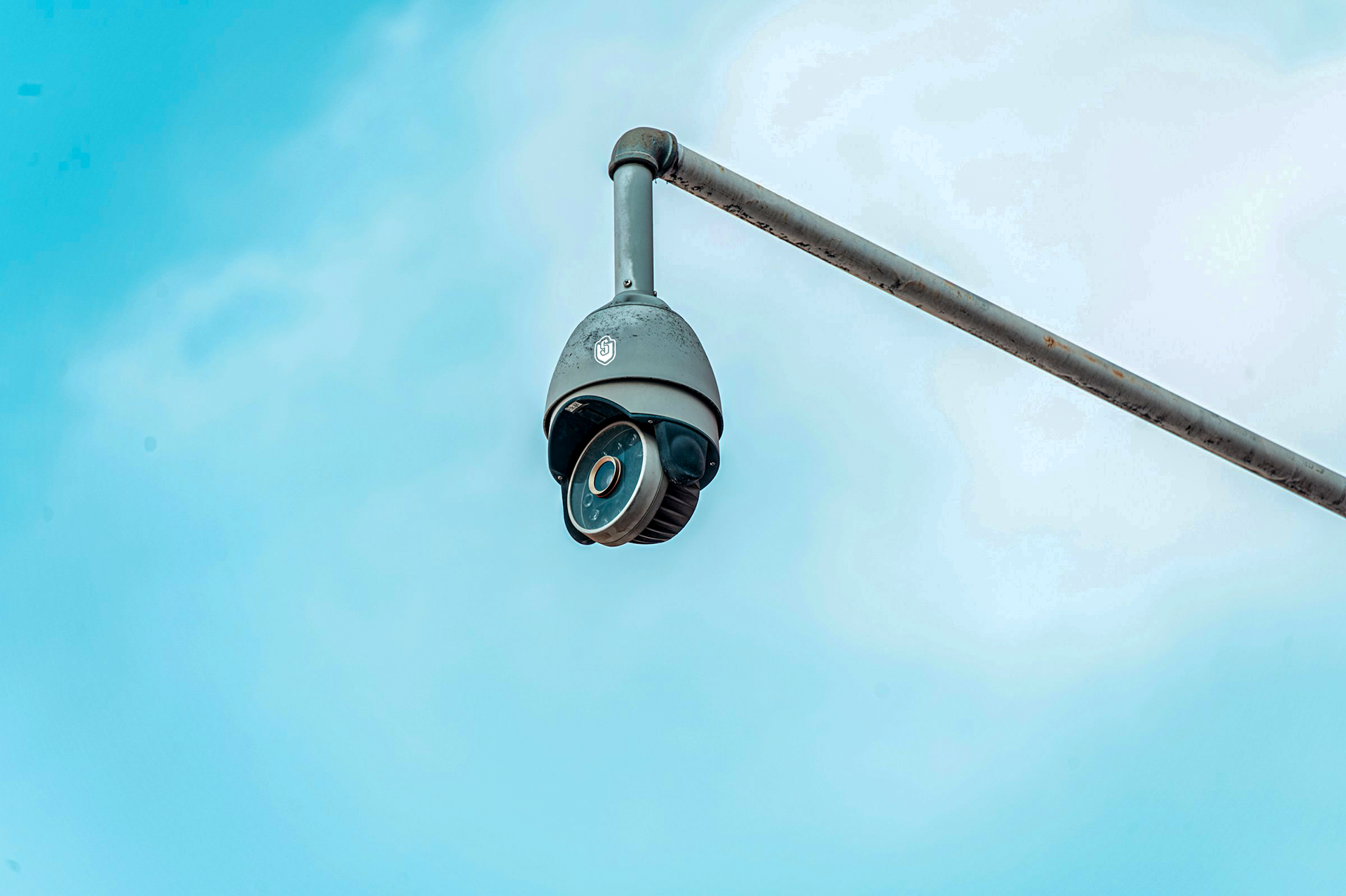
Instead of leaning into humor visually, the identity adopts traditional security cues: a heraldic shield, a monogram mark, and blackletter-inspired typography. This establishes credibility and institutional weight, allowing the brand’s personality to live in the naming rather than the aesthetics.
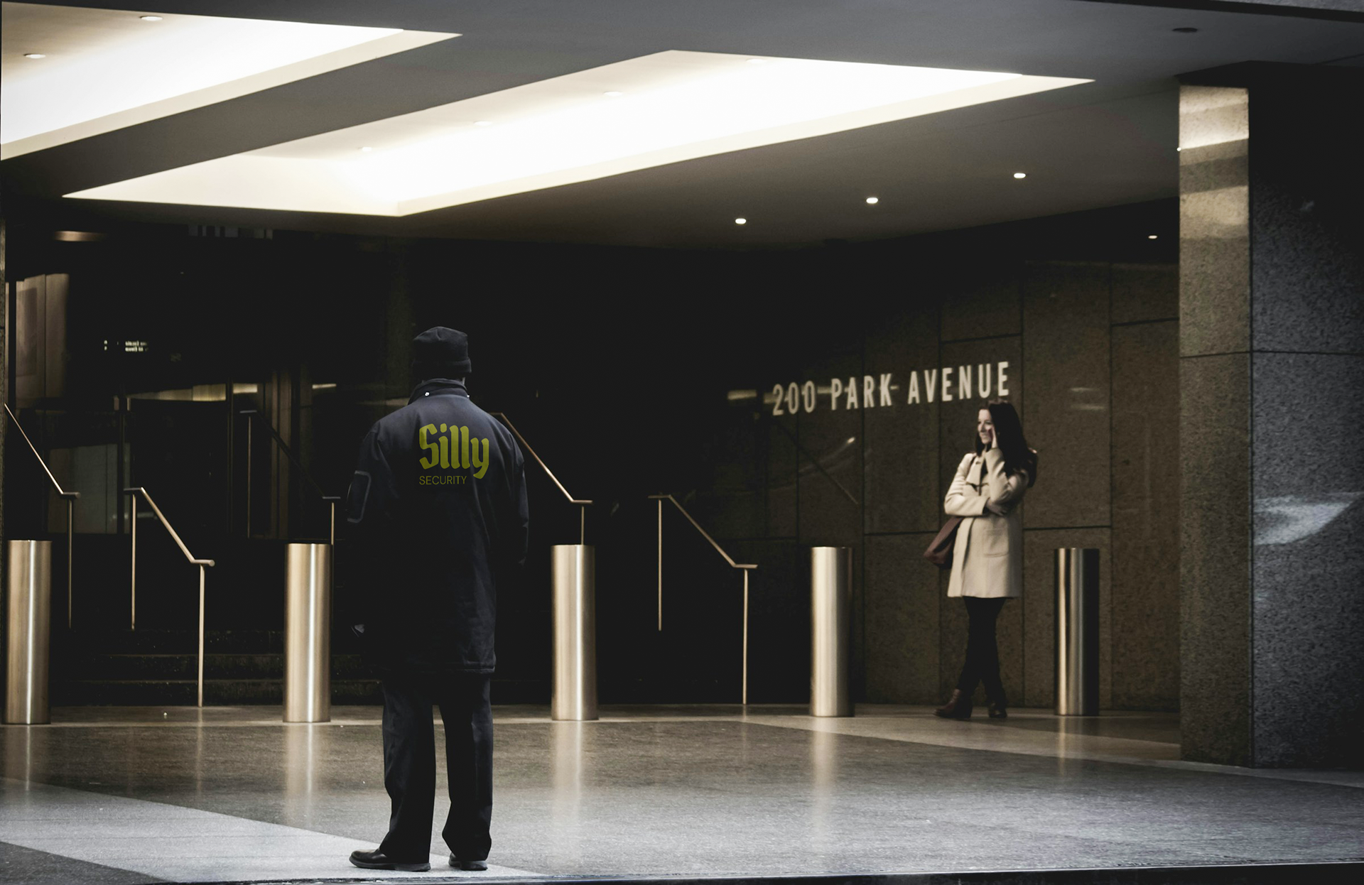

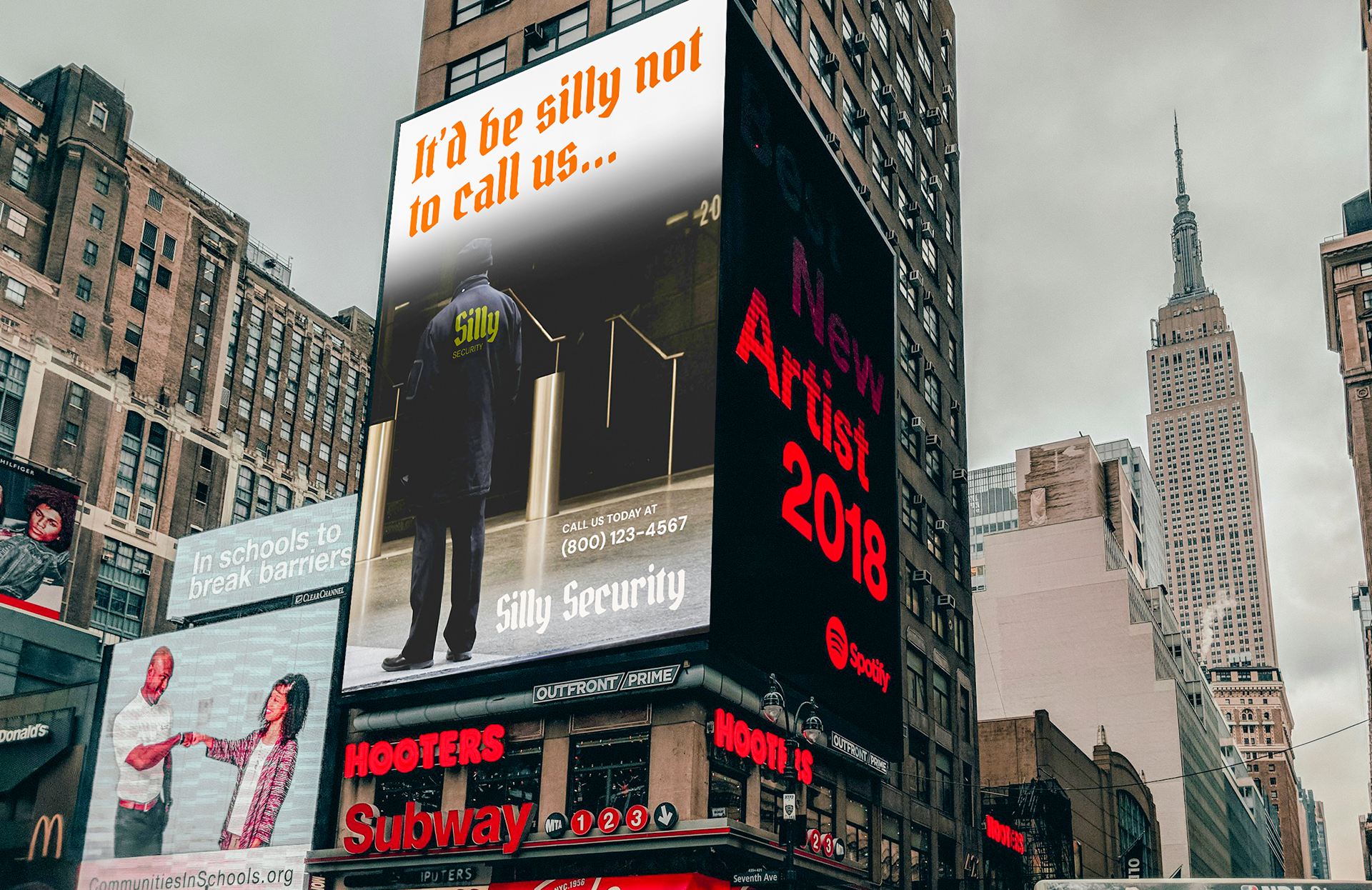
The identity was developed as a flexible system rather than a single logo. A primary wordmark, a short-form lockup, and a shield monogram allow the brand to scale across applications, from uniforms and badges to signage and vehicles, mirroring real-world security branding structures.