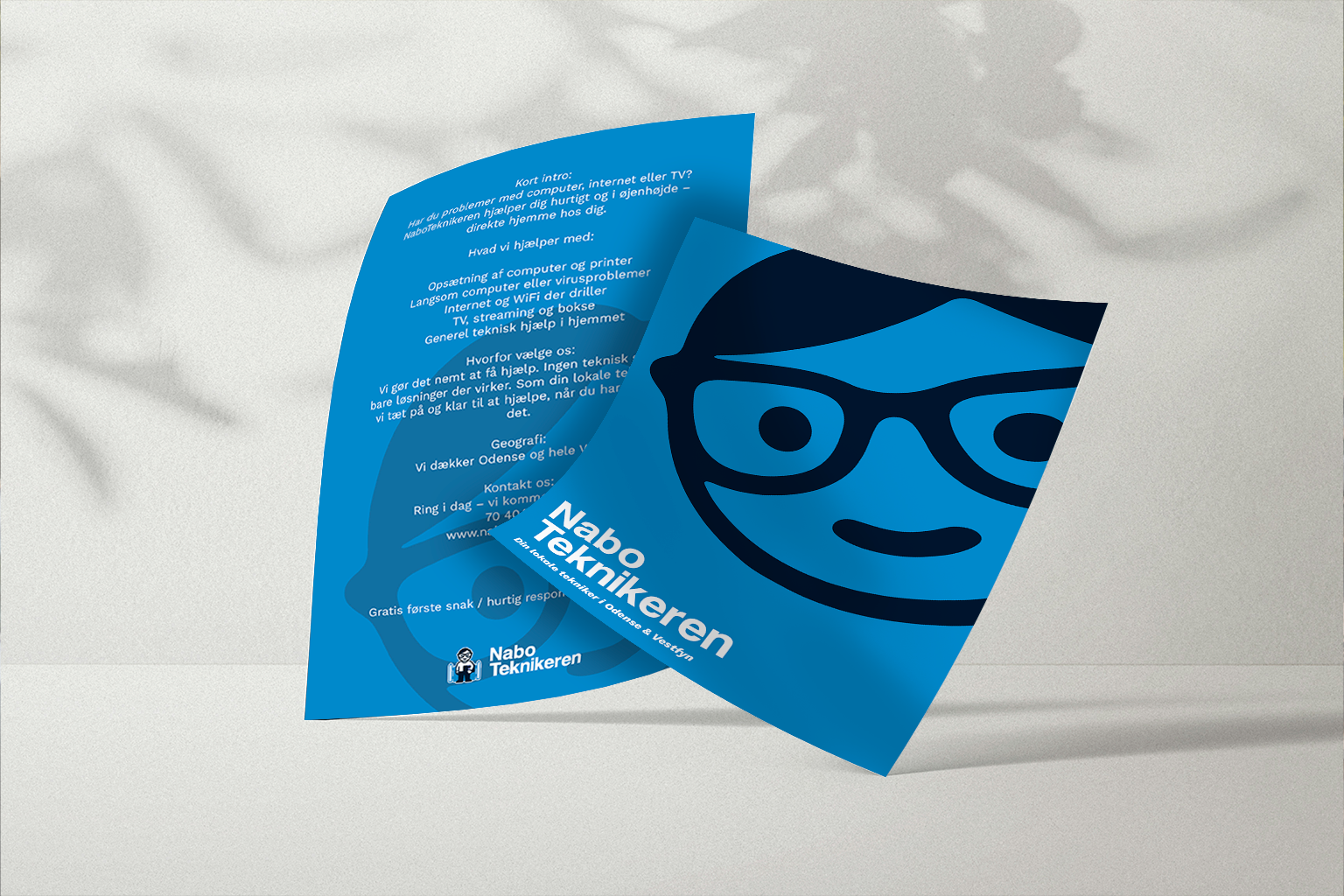
NaboTeknikeren had already built a reputation as the friendly local expert, but its visual identity no longer reflected the quality and professionalism of the service behind the brand. Our challenge was to create a more refined and cohesive identity while preserving the warmth, familiarity, and trust that customers already associated with the business.
Through strategic logo refinement, visual simplification, and a complete brand system, we transformed the brand into a modern identity that feels both approachable and professional.

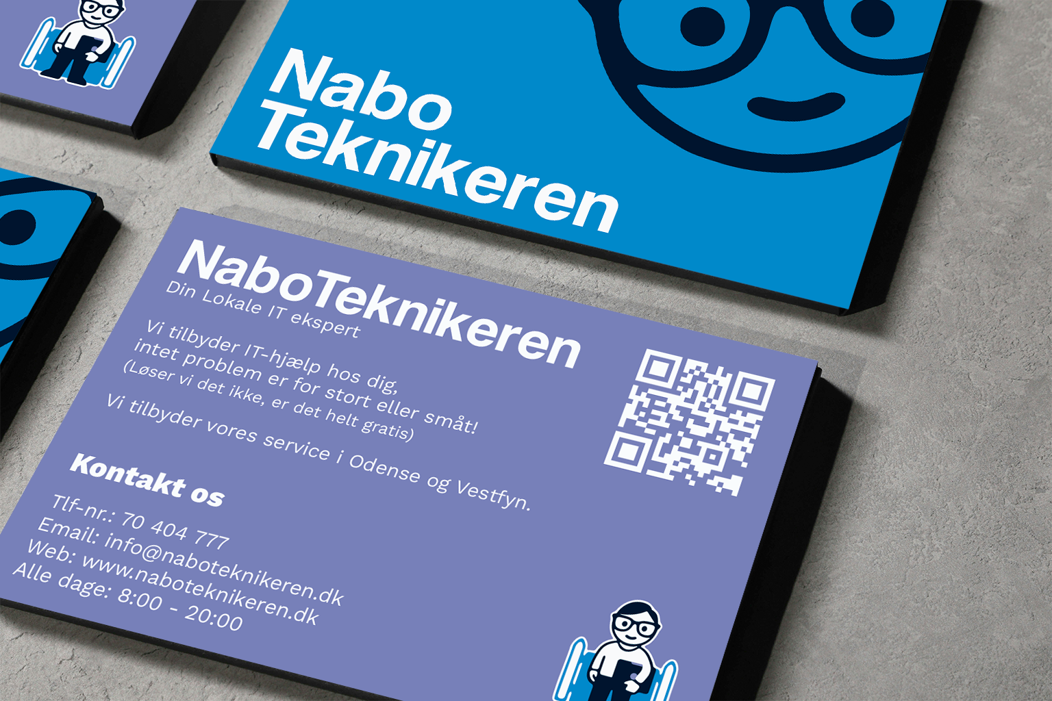
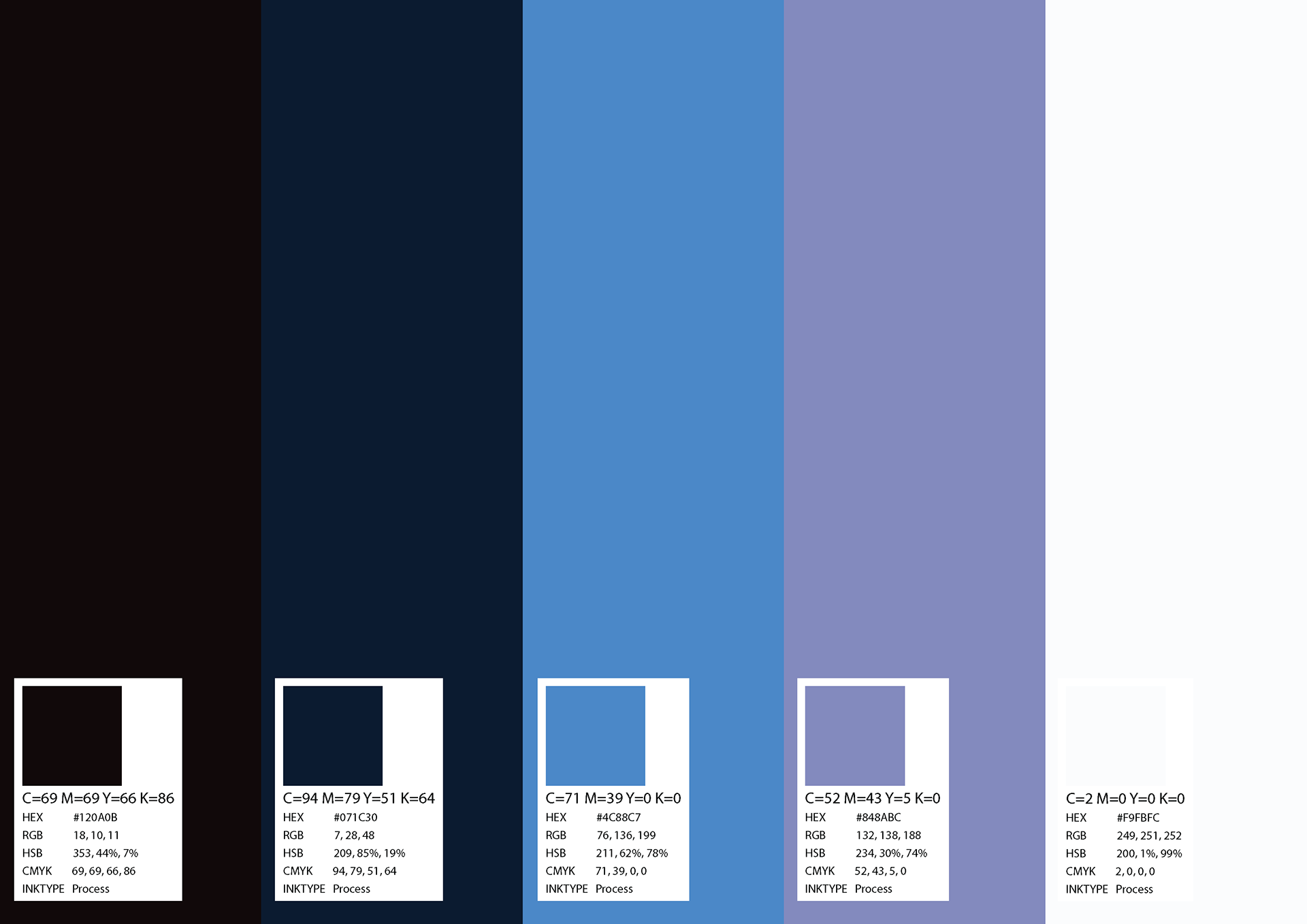
Rather than starting from scratch, we focused on evolving what already worked. The logo was carefully rebalanced, the mascot was refined for greater clarity and versatility, and the typography and color palette were redesigned to create a stronger visual hierarchy.
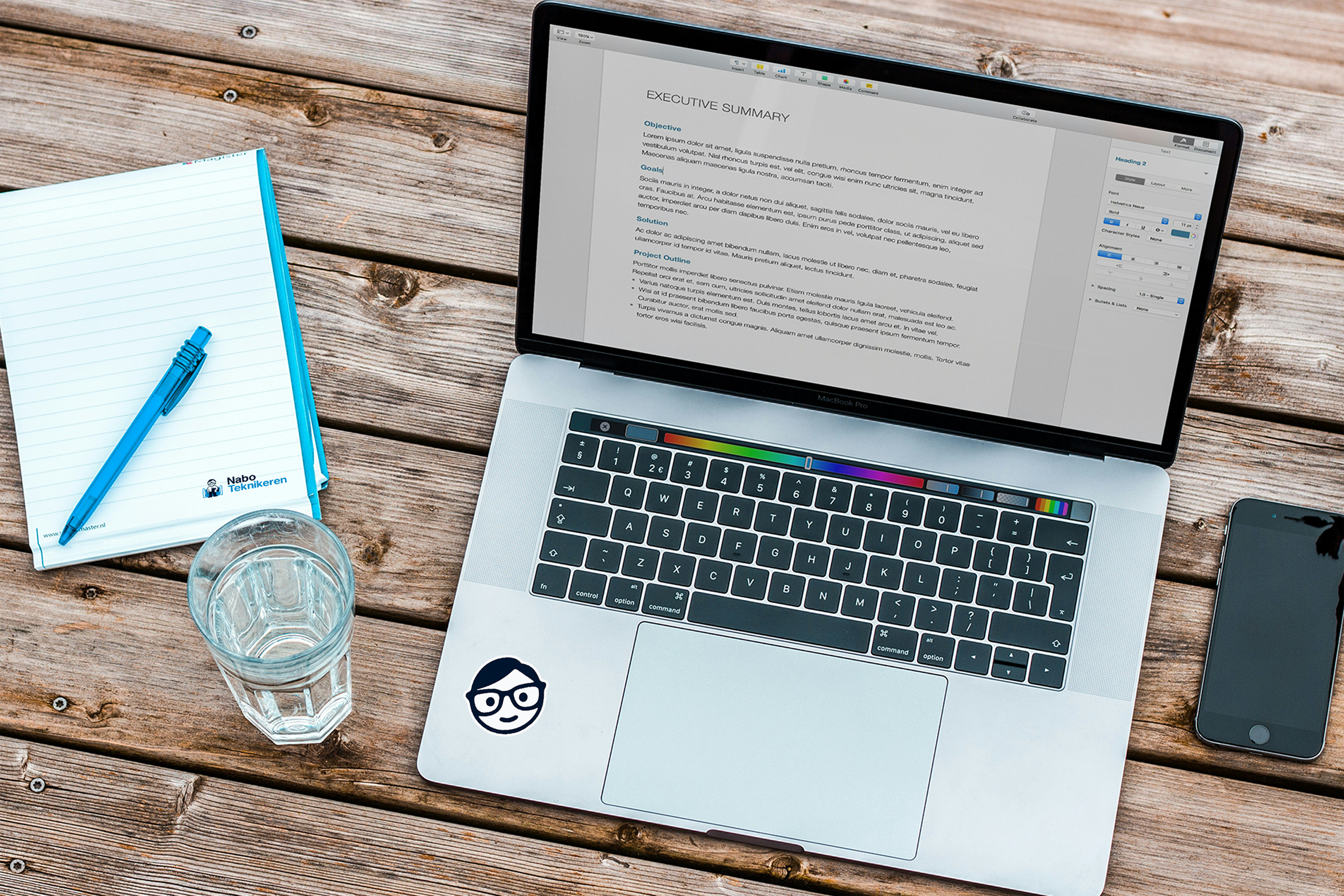
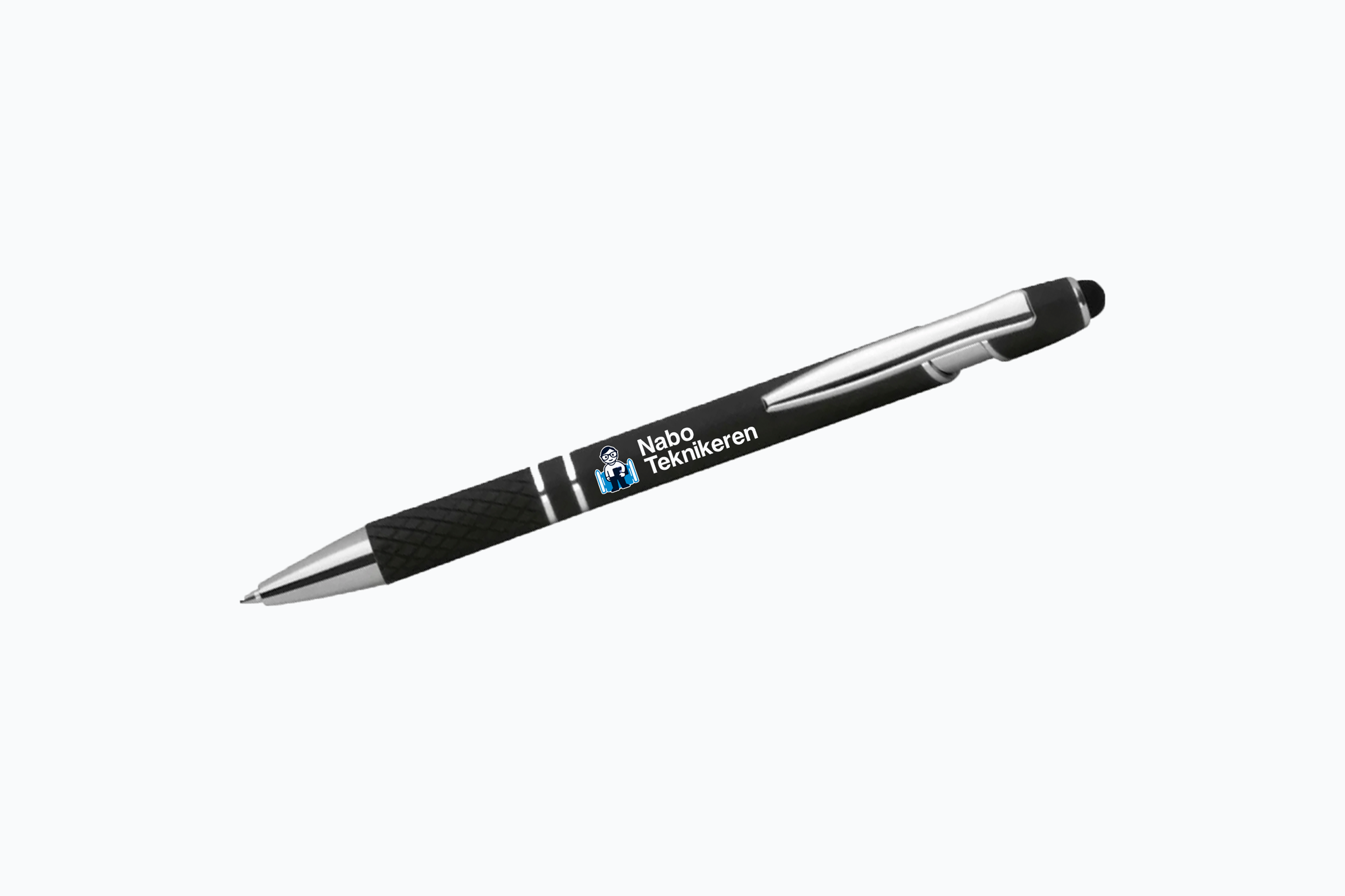
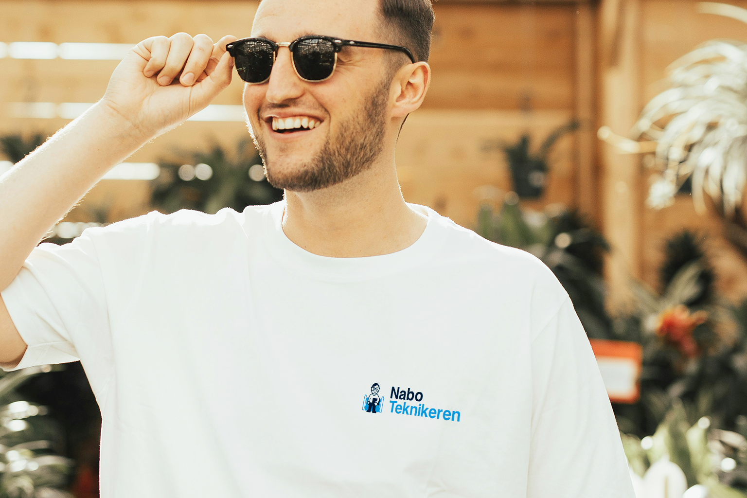
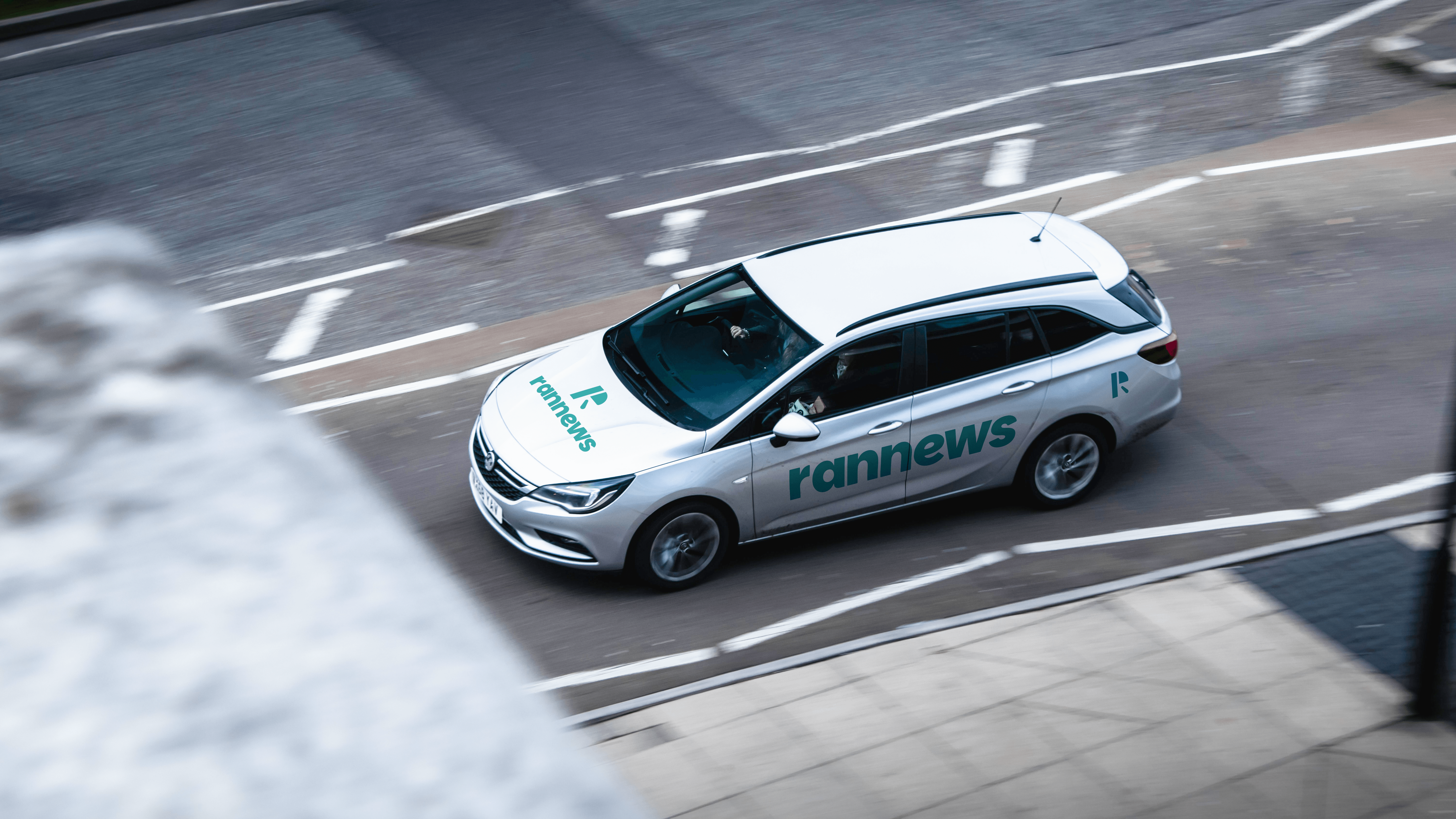
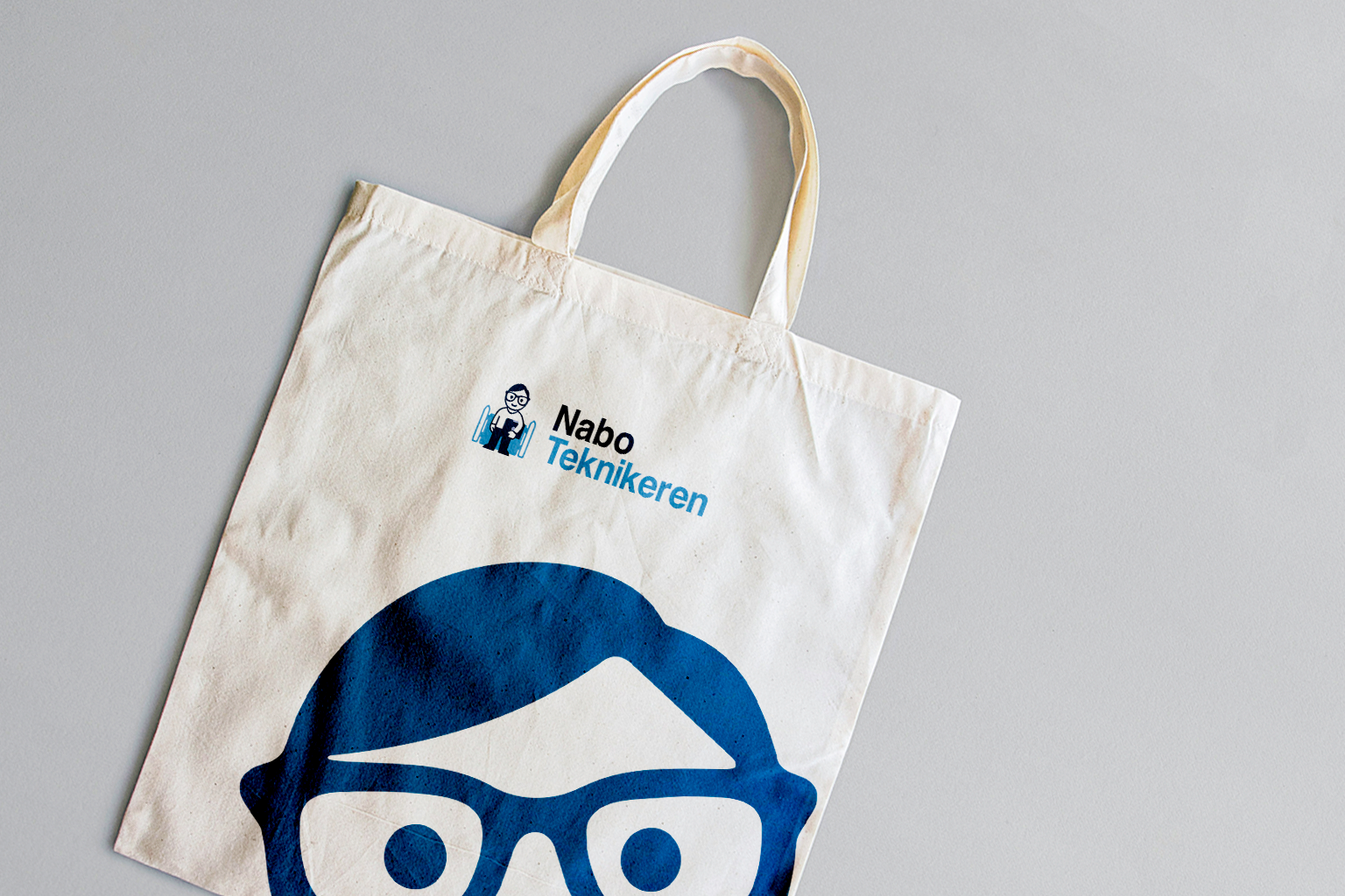
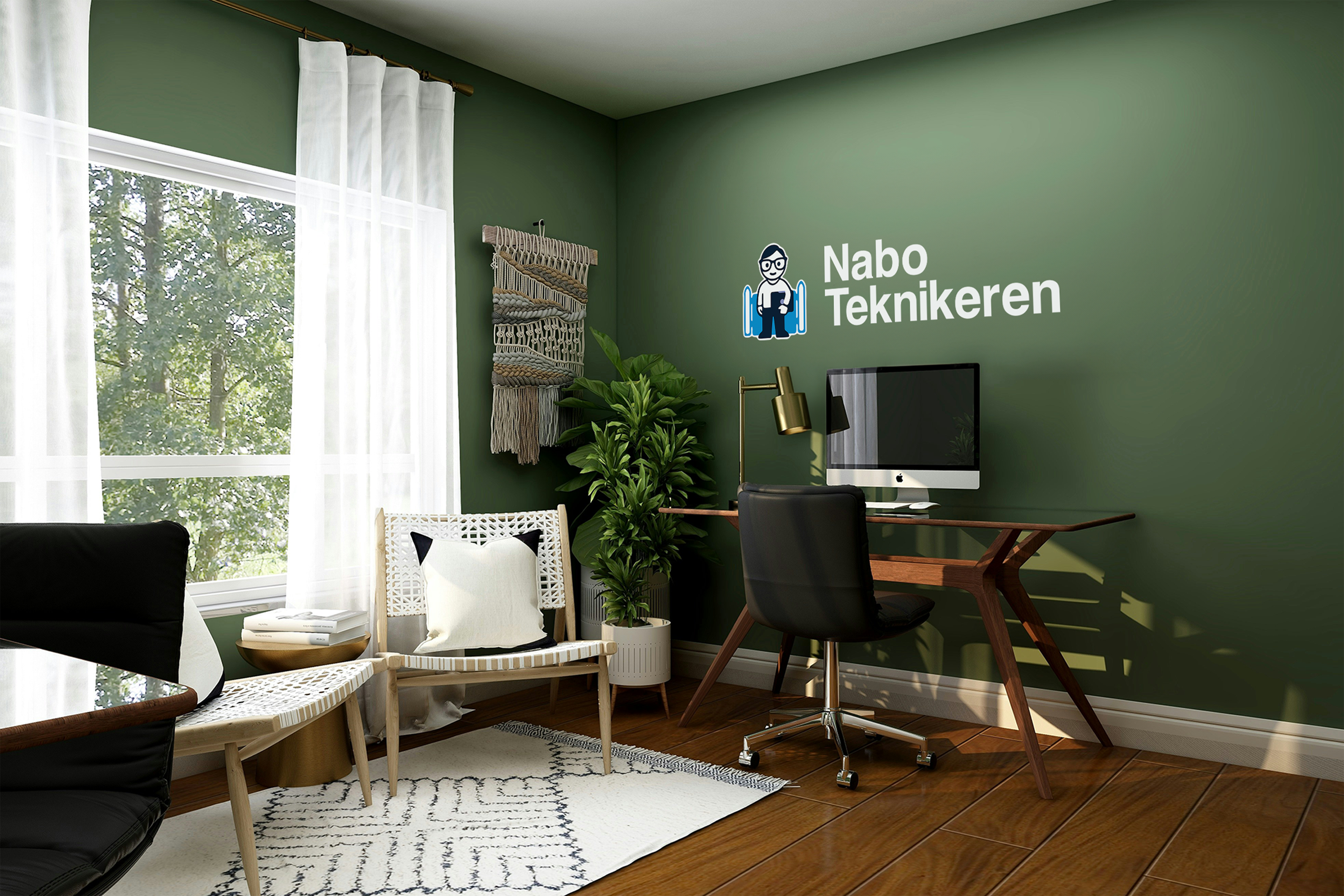
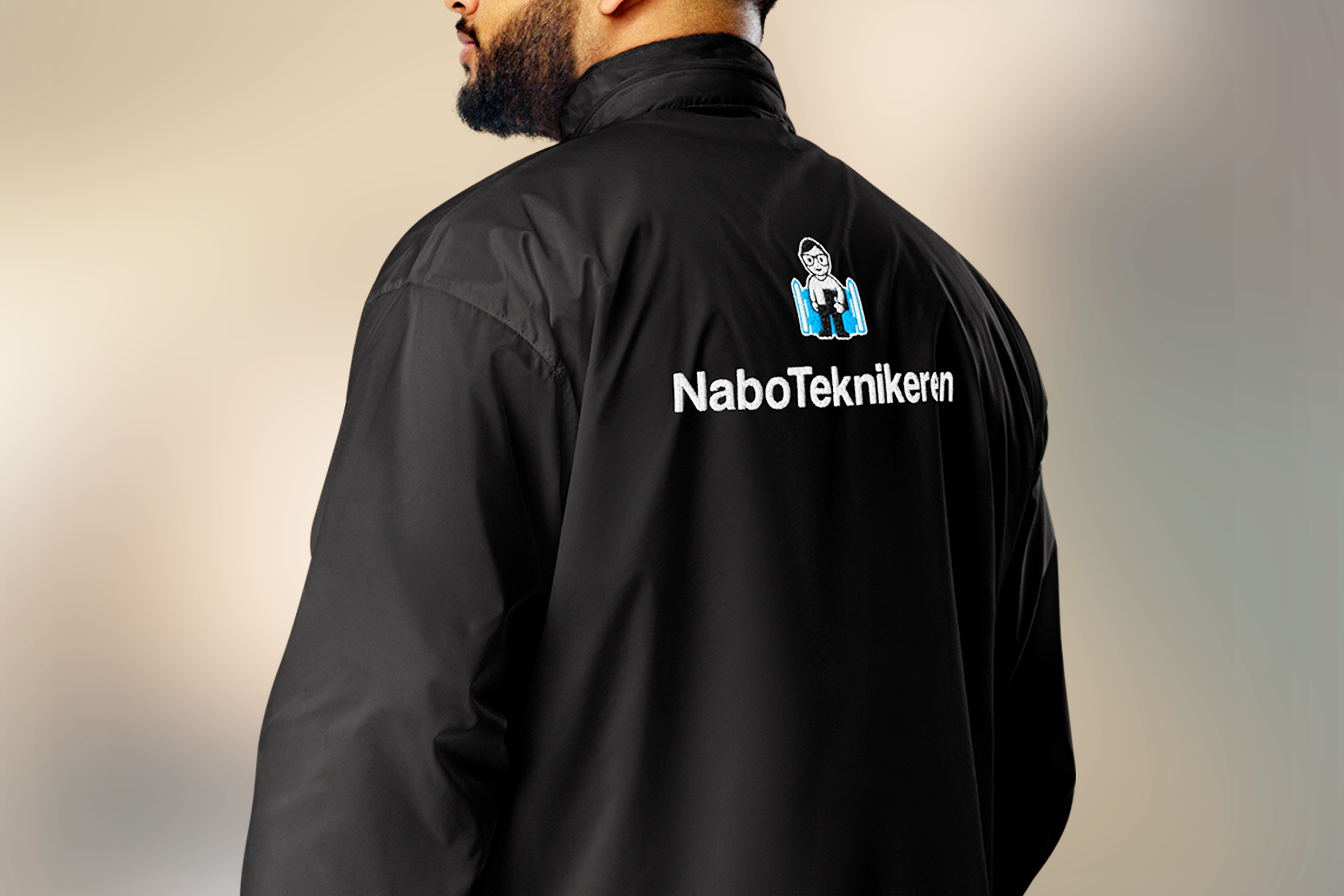
Every element was developed to work together as one cohesive system, ensuring consistency across digital platforms, printed materials, workwear, signage, and future marketing assets. The result is a brand that communicates expertise without losing its human touch.
The final identity gives NaboTeknikeren a stronger presence across every customer touchpoint. Clearer, more balanced, and easier to recognize, the new brand system reinforces trust while creating a more memorable experience.
By combining professional credibility with a friendly neighborhood personality, the refreshed identity positions NaboTeknikeren for long-term growth while staying true to the values that made the business successful in the first place.